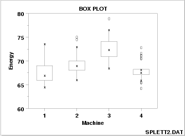
This box plot map outlines the energy efficiency of four separate machines. These types of maps are great for identifying differences in groups of data using a graphical plot. The box is made up of the the middle 50% of the data and the top and bottom of the box are the upper and lower quartiles. The lines going up and down from the box represent the minimum and maximum measurements.
No comments:
Post a Comment