
Sunday, July 17, 2011
Classed Choropleth Map
Similarity Matrix

Geologic Map

Lorenz Curve

Population Profile Map
These types of maps are designed to depict population over a piece of land as well as other statistics that go along with population such as age and sex. This map is of Texas and it depicts amount of population, as well as density, sex, and age. There is also a pie chart on the side that depicts race in the state.


Choropleth Map

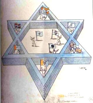
Propaganda Map
Contour Map

Hyposometric Map

Range Graded Proportional Circle Map

Correlation Matrix

Pictograph Map

Mental Map
Standardized Cloropleth Map

Univariate Cloropleth Map

Isopach Map
Isopach maps are used to define the thickness within flat pieces of land. This is an Isopach map of Mount Pinatubo in California that erupted on June 15, 1991.
Isohyet Map

Isotach Map

LIDAR Map

Statistical Map

Flow Map

Isoline Map

DEM

Hyposometric Map

Cadastal Map
Thematic Map

Topographic Map

DLG Map

Unclassed Choropleth Map

Unstandardize Choropleth Map

Bilateral Map

Nominal Area Choropleth Map

Cartogram

Infrared Areal Photo
Stem and Leaf Plot

Stream Flow Map
Stream flow maps are used to outline data over a set amount of time such as years, days, months, hours, ect. This particular stream flow outlines the amount of percipitation in the United States from 2001 to 2008.

Cartographic Animation

Climograph

Histogram

Hyposometric Map

Triangular plot
Triangular plots represent three different variables such as percent of voters which can be seen in this particular plot map. This type of map is useful because it shows a graphical measurement that compares three variables on a three equal sided triangle leaving little to me misinterpreted.


Scatter Plot

Wind Rose map

PLSS
The Public Land Survey System type of map is very important because it legally outlines land parcels. This particular map shows the United States and it's interior, separate townships within states.


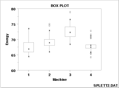
Box Plot
Star Plot
Saturday, July 16, 2011
Dot Distribution Map
This particular dot distribution map uses blue dots to signify corn harvesting in 2002. Each dot represents 10,000 acres of harvested corn.


Proportional Circle Map
This Proportional circle map I have found very interesting as it depicts democratic support for Barack Obama with the blue dots and Republican support for John McCain as the red dots. The differentiation in size depicts the amount of supporters in the county relative to population


Propaganda Map
This is a map drawn by a Japanese person depicting a Russian threat to the east. This map is considered very powerful propaganda material for it's time.


Planimetric Map

Subscribe to:
Comments (Atom)